



Stop looking for the grid.
For years, web design felt like a strict architecture class. You had your 728×90 leaderboards. Your 300×250 medium rectangles. Your 160×600 sidebars. Everyone knew where things lived. It was predictable. It was safe. It was boring.
The last year or two has shredded that rulebook. Advertisers and publishers are testing varied shapes and sizes with a frantic energy that suggests the old standards are dying. Why? Because users are blind to the familiar. They scroll past the standard spots without a second glance. To get attention, you have to break the pattern.
You can’t just drop a banner in the usual spot anymore. You have to think about placement like a puzzle, not a template.
Why Standard Sizes Are Failing
It isn’t that the dimensions are wrong. It’s that they’re expected.
When an ad looks like an ad, the brain filters it out. This is “banner blindness,” and it’s real. By trying all different sizes and placements, designers are forcing the eye to stop. A tiny ad in a weird corner might get more clicks than a giant billboard at the top because it feels unexpected.
The goal isn’t just visibility. It’s disruption.
The best ad is the one that doesn’t look like it’s trying to be seen, until it is.
Three Examples of Non-Standard Placements
You don’t need to reinvent the wheel, but you might need to make it square. Here are three ways people are playing with size and shape right now.
-
The Micro-Insertion
Tiny. Almost invisible. Placed mid-content rather than in the margins. It respects the reading flow but interrupts the rhythm just enough to register. -
The Full-Width Takeover
Instead of a sidebar, the ad spans the entire width of the viewport. It’s aggressive. It forces a choice: read the content or acknowledge the brand. It works because it removes the “ignore it” option. -
The Asymmetric Sidebar
Forget the tall, thin rectangle. Try a blocky, wide shape that sits unevenly in the margin. It looks like content, not an ad slot. The mismatch creates visual tension. Curiosity fills the gap.
None of these are easy to implement. They require custom code. They break responsive templates. But the standard sizes? They’re fading.
If you’re still using the same three sizes from 2018, you’re shouting in a library. Quiet is loud. Weird is noticed.
The next part covers the technical side of making this work without breaking your site.
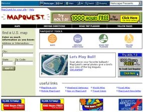



Why stacking ads actually works for publishers
The math is ungenerous. A single small ad barely pays. Click-through rates are abysmal, mostly because users have developed banner blindness. They scroll past without a second glance.
But volume changes the equation.
Publishers don’t rely on one hero banner. They stack them. Ten small ads on a page might each earn pennies, but collectively they generate about $2 per 1,000 impressions. It’s a volume game. Low yield, high density. The goal isn’t a click from every user. It’s just enough noise to make the revenue add up.


