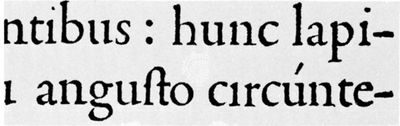
Roman type isn’t just a font choice. It’s the backbone of Western reading. Among the three major historical typefaces—roman, italic, and black letter—roman holds the crown for importance and widespread use.
When movable metal printing arrived in the mid-15th century, early printers copied manuscript scribes. They used black letter. This style looked like medieval handwriting. The letters were heavy. They were spiky. Today, we often call this Gothic.
It was ornate. It was probably easier to write than to cut into metal molds. But it was hard to read. It wasted space. Paper was expensive. Black letter drained resources.
Humanist scholars pushed for change. Scribes in scriptoria experimented with a new face. They believed it came from ancient Rome. The result was simple. Straightforward. Unembellished.
Historians now trace this style to Charlemagne. An English monk named Alcuin developed the “official” letter form for his decrees in the 9th century. It wasn’t truly Roman. It was Carolingian minuscule.
Who used it first? Adolf Rusch in Strasbourg printed with it in 1464. Sweynheim and Pannartz in Subiaco, Italy, used it in 1465. The title depends on how strictly you define “recognizably roman.” A Venetian printer patented a roman cut in the 1460s. He died before it took effect. The patent was voided.
The shift marked a move from decoration to clarity. Space became efficient. Reading became faster. This wasn’t just aesthetics. It was practicality.
The design spread. Printers adopted it. The style endured. Other options faded or specialized. Italic appeared later. Black letter retreated to specific uses. Roman stayed.
Why does this matter today? Because we still read roman type. Every screen, every book, every sign. The lineage is clear. From Alcuin’s monks to your browser. The form survived. The function remained.
Newer fonts emerge. Trends change. The core structure holds. It’s quiet. It works. You notice it when it’s gone. Or when it’s replaced by something harder to read.
The history is messy. Patents expire. Printers die. Names shift. The type stays.
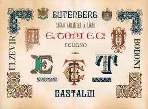
The German Hold on Blackletter
It didn’t take long for roman type to conquer the world. Within a hundred years of its debut, it had swept aside nearly every other script. Except in one place. Germany held the line. Black letter remained dominant there, well into the 20th century, while the rest of Europe moved on.
This wasn’t a accident. Type designers of genius adapted the style. They refined it. Made it workable for mass production. It became the standard for book typography in regions that stuck with tradition.
Why did it persist? Tradition has weight. Ink on paper feels different when the letters are dense, vertical, and heavy. Roman type is open. Clean. Blackletter is something else entirely. A visual texture.
Most of the world chose clarity. Germany chose heritage.